
Fourth post: Before the decade ends anyone wanna admit they got a crush on me ;;;^)
- Kyra Moe

- Dec 19, 2019
- 2 min read
Since my last progress check I have made some reasonable progress but I would like to be farther than I am at the moment. I put in all the base colors and have started basic shading but I still have a lot of detail to add to each piece before the due date. Really, my biggest issue right now is trying to manage my time correctly so that I can make my piece as detailed as I want it when the due date comes.


A big problem I am having is that the oil paint I am applying isn't staying wet for as long as I want it (even though oil paint is supposed to stay wet for a long time) and this is making it hard to keep blending when I come back to my pieces. I think this might be due to the fact that the oil paint is water soluble, thus not true oil paint. So I guess the best way to deal with that is to apply more paint so it takes longer to dry and to take shorter breaks from the piece so it doesn't dry out when I'm not working on it. In terms of how the theme is conveyed, I always have a problem with making the concepts of my artworks hard to figure out by just looking at the piece. I feel like my current piece has improved a bit on this without the concept being too obvious.
NOW FOR AN ARTIST THAT SLIGHTLY RELATES TO THIS BUT IS MOSTLY JUST A BIG INSPIRATION FOR ME IN GENERAL
MADOKA KINOSHITA
Website link: https://madotti.com/
Youtube link: https://www.youtube.com/user/07madoka/featured

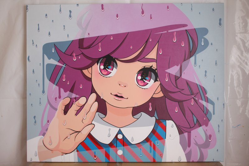

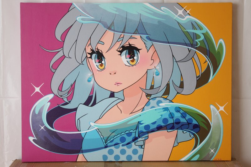

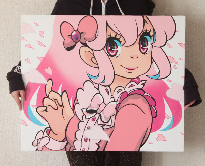

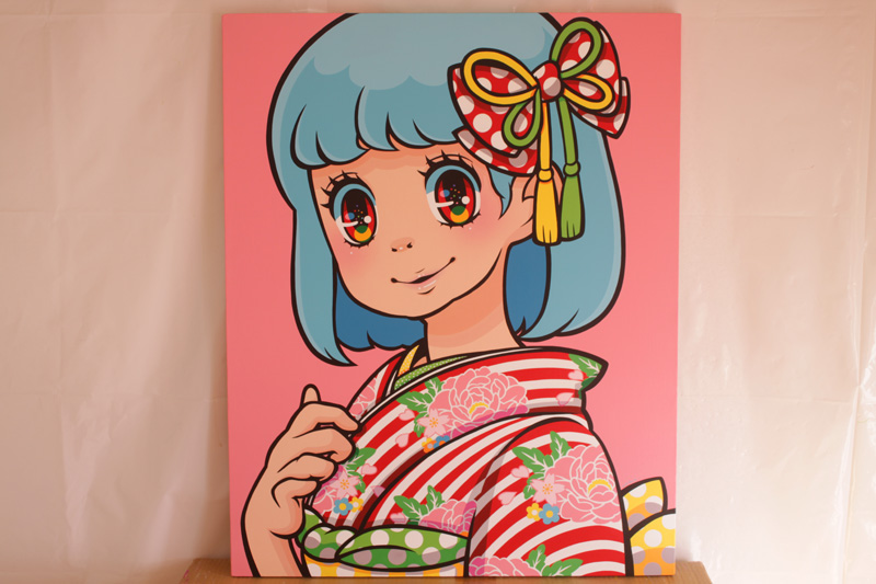

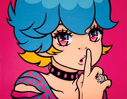
Madoka Kinoshita is a Japanese artist that creates very bold and clean pieces on large canvases with acrylic paint. I love her cute, lively characters that draw on a shojo manga style while still being unique to her. Her pieces are so clean and graphic that they look like they are made digitally, but they're not!! and that's what makes them so impressive (along with the large sizes they come in). I've been watching her since 2014 and she has inspired me to come out of my shell and try more graphic styles with bolder colors than what I would use before. She also inspired me to draw more "cutesy" things, which has helped me grow my style into what is now.
See y'all next decade :)
(I'm so sorry about this)


Looking good; you're probably the furthest along out of everybody, honestly, and it's great that you're keeping your pace up. I like how you added the cushion (unless it was always there) since it adds an extra layer of symbolism while getting rid of some of that empty space. It might be just me, but now that you've got something like that behind the woman, it feels like something's missing behind the stalker, like a flat black might not be the best thing to have there. Maybe just a little gray in there could tie that together. I dunno.
Your progress so far is pretty significant, and I am very proud of you! However, be careful if you are adding thick layers of oil paint. It could crack if you put too much, and I would hate to see that happen. To counteract this, I suggest mapping out your planning in a simplistic way so you know where you need to put your extra paint and avoid using too much. Anyways... that's about all the advice I have for you! Great work!