
Third post: hot diggity dog :^O
- Kyra Moe

- Nov 26, 2019
- 4 min read
Wazzup I'm back to share my progress about my piece. So as you might know the theme of my piece is stalkers / delusional stalkers and I decided to create my piece with two large canvases, oil paint and acrylic paint. I am about exactly where I anticipated being in the creation of the piece. I have almost all the base colors down which means I should rendering the piece soon. I just need to fix the brown background in the girl piece to make it more of a beige and have the color of the stalker dude be more of a gray blue. Here are some pictures of my progress:


Each canvas is () inches by () inches and I'm not sure how I want to display the pieces. I don't know if I should but the girl piece in front of the stalker piece or vise versa. I would love get your opinion on the matter!
I had a group critique with some of my peers today about our pieces and they have me some valuable feedback! They loved how fleshed out my planning was, which was interesting because when we first started this project I had no idea what I was going to do. They also suggested that I make the parts inside the eye in the girl piece more stylized than the parts that are be outside the eye. I really like this idea because it reinforces my want for everything inside the eye to be imaginary/ fake. I also threw out the idea that I wanted to add writing onto the love letters that are going around the woman (which will be sent from the stalker to the woman) but the group said that it would be incredibly difficult due to the small size that the letters would have to be. The conclusion we came to was to write the letters with an ink pen once all the paint has completely dried; this would be done as a final touch. Now the question is what exactly am I going to write in those letters? I know I want the letters inside the eye to be romantic and cute while the ones outside the eye will be creepy. I think I should look at examples of love letters and stalker letters online and take my inspiration from there. What do you guys think? Is there anything that I missed or you think I should add or remove from the piece? I'm open to any ideas that will help make my piece better!

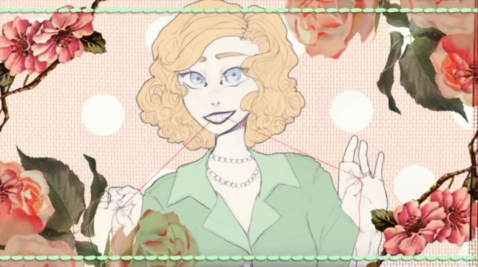
I want to take this section to talk about an artist that I discovered at the beginning of the school year. Her online alias is GHOST and she has been a huge inspiration for my piece and for my artwork in general. GHOST creates what I can best describe as PMVs (picture motion videos) with original art and music. Almost all of her work covers disturbing or dark topics and she creates pieces that is very unique to her. The songs she makes are sung by digital voice boxes (not her voice, but a digital program) which gives the music an eerie, inhuman feeling that fits very well with the themes of her songs. She writes all her own lyrics, creates her own artwork and edits her own videos together to create amazing experiences that are hard to find anywhere else. There are three songs of hers that have specifically inspired me for this project.
Spider on the Wall

This song is the most obvious of my inspirations for my piece. As you might be able to guess, it's about stalking and being watched. I love creepy atmosphere of the song created by the robotic voice, ominous lyrics and eerie artwork. It really gets me in that "draw some creepy stuff" mood
Honey I'm Home

The story of this song has nothing to do with my piece, BUT, I have taken a ton of inspiration from the imagery and general atmosphere of the song. It's hard to find the meaning behind this song other than some sort of creepy cult doing some messed up stuff. This also gets me in the "draw some creepy stuff" mood.
HOUSEWIFE RADIO

Now, this song is part of a discontinued series of songs with a connected story that GHOST made back in 2016. The plot is a bit complicated but I'll do my best to explain it.
There are three main characters in this story: Nancy, the housewife, Henry, her husband, and Frances, Henry's abusive mother. Henry cut off his abusive mother after getting married to Nancy and tried his best to forget about his mother. Nancy has synestheisa (seeing sounds in color, hence the extremely colorful imagery) and this causes her a lot of mental distress. She would often have mental breakdowns and would often rely on Henry to support her. She was afraid that he would leave her just like he left his mother. Eventually, this came to be as Henry couldn't take Nancy's breakdowns anymore and tried to leave for good in the middle of the night. She noticed he was gone form their bed and went to the living room to see where he was. She saw him taking his first step out the door with his suitcase and once she realized what he was doing she snapped. Nancy took a knife, slit Henry's throat and stabbed his face until he was unrecognizable. This song takes place in the days after when she was trying to go on with life as usual, but her housewife facade cracks as the guilt of what she has done grows heavier and heavier. Eventually she can't live with it guilt anymore and hangs herself in the basement next to the corpse of her Husband.
Woo, that was a lot. Most of my inspiration from this song comes from the bright colors, the portrayal of the "perfect woman" and the juxtaposition between idealization and reality. This song has become a huge influence on my woman piece and on my artwork in general.
In conclusion, GHOST is epic and you should go check her out. Have a wonderful day my dudes :^P


Nice progress! I think you could put the painting of the woman above the one of the stalker possibly... because she's held in high regard by this individual and they look up to her. I dunno. It might not be a bad idea to put the woman on the left and the stalker on the right so that they're facing away from each other as they've never met; she looks away and doesn't notice while the stalker is stuck looking only at the ideal version of her that they've created. Could fit with the concept a bit more, but maybe the others are right about it being an overall better way to frame them.
Anyway, it's looking dope so keep…
I admire your dedication into this project, as well as the cleanliness of what you have so far. Your color choices are very fitting, and I also like the symbolism you chose. I do agree with the layout suggested by Scout and Layla; I think that it unifies the pieces better. I think you should continue your idea of writing something in the letters, though, as it would fill that empty space with added symbolism. I would suggest that you write it with a color that would match the rest of the painting, though. I'm picturing black writing within the letters of the lady painting and I personally don't see it fit too well; I suppose experimentation with writing colors…
Your paintings are coming along great! Your color choice is very appealing, and I absolutely love the color shift within the eye of the stalker. Additionally, I am pleased you decided to use the glitchy effect on the girl to show the stalker's distorted view of her. It would be a better composition if you put the stalker piece on the left and the girl on the right. By doing this, their bodies would create a V shape because of how they are angled. It would make the artworks seem more cohesive and flow into one another. I can't wait to see these more finished!
You've made some really great progress on your pieces so far, so good job. I think as far as displaying them goes, the one with the stalker should be on the left and the girl should be on the right. This way, the forms of their bodies create a frame and it reads like one closed image which leads your eye naturally in a circle around the two pieces.